Hey again!
Wow, two in a row. That never happens!
Anyway, these are just a few boards I did for work. They are only 4 panels out of abour 16 or so pages. I say "or so" because this episode is mixed animation with live action footage, and I only needed to board the animation stuff. So there's a ton of blank panels scattered throughout the boards. Well that's enough of that.
This is just a simple back and forth dialogue sequence between two characters. I hope their expressions say it all, so... Leave me some feedback! See ya!
Storyboards, Animation, Doodles, Fun! And of course, All original artwork on this blog has a copyright.
Sunday, December 30, 2007
Saturday, December 29, 2007
New Reel For The New Year!
Ok... Well only some of it is new. I wanted to update my reel.... So I did. Some is the same as before, some is reordered, and there's a few new things. Mostly Flash I think... Sorry Joe.
Have a happy new year! See you.... IN 2008!!!!!!!!!!
Sunday, December 9, 2007
Conductor (Textures Ahoy!)
Tuesday, November 27, 2007
The Cleaner
Hi!
Here's a blast from the past. This is my final project for the class "Alternative Strategies in Animation", basically, not Flash or 3D or tradional. I shot the footage and then cut frames to give it a pixilation feel, and then I drew each frame of animation for the robot in Photoshop, then slapped it all together. Hurray! Hope you like it! It was fun to do.
Sorry about the quality. I had to upload it to Youtube, so I had to use a compressed version.
Sunday, November 25, 2007
Colored Goon Frog
Saturday, November 24, 2007
Frogs
Heya!
So at work, we will be doing an episode with some frogs in it, and I did some designs. This first image is just a jumble of frogs, the three I liked best being inked.
Then I had to revise them a bit.
And lastly, I had to revised again the one in the hoodie. He changed the most, because the first attempt, I made him a nerd, and then I made him kinda tough, and finally now, he is just some dude. Who plays marbles. Alone.
Enjoy.
Monday, November 12, 2007
Kraft
So here it is. I wanted to wait until today because it was, or rather, it is in a contest for Kraft. It's just a quick fifteen second commercial and we at work decided to give it a shot. I was worried about posting it on my blog but when you submit it to Myspace (Who is holding the contest), they give you code to embed it. So I guess it's ok!
I did everything except the sound and the writing. I'm excited because I got to use my designs for everything. Also, animating Carl (The weird monster) was a lot of fun.
I did another one with Victor, but I will post that one later on. Probably tomorrow.
PS: The Fly's name is Jonathan.
I did everything except the sound and the writing. I'm excited because I got to use my designs for everything. Also, animating Carl (The weird monster) was a lot of fun.
I did another one with Victor, but I will post that one later on. Probably tomorrow.
PS: The Fly's name is Jonathan.
Sunday, November 11, 2007
Stop Motion Mania
Yo,
So I have had stop motion on the brain the last week, and figured I would put my stop motion short from two years ago up for everyone to see. I think it came out pretty good.
In regards to those two lil' characters from my previous post, I have a little 15 second animation of them that I will post within the next few days. Due to circumstances I have to wait before I put it up, so.... There's something to look forward to!
Tuesday, October 30, 2007
Would You Like Flies With That?
Sunday, October 28, 2007
Critters
Sunday, October 21, 2007
Just A Reminder!
So I should have probably posted this sooner, but I have the official time and place for the screening of Glory of Humanity.
It is tomorrow, October 22, 2007 at 11:45 AM at the Harold Washington Cultural Center. I do believe that it is on S Kings Drive an 47th.
GOH is playing as part of the "Do The Right Thing" program, which lasts about 70 minutes or so.
It should be interesting, so check it out!
It is tomorrow, October 22, 2007 at 11:45 AM at the Harold Washington Cultural Center. I do believe that it is on S Kings Drive an 47th.
GOH is playing as part of the "Do The Right Thing" program, which lasts about 70 minutes or so.
It should be interesting, so check it out!
Sunday, October 7, 2007
Trees
Monday, October 1, 2007
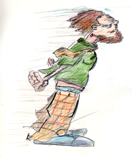
Grunt
Heya,
I drew this quick sketch the other night and kinda liked it, but didn't know what to do with it.
Then today I decided to try to ink the lines nicely, but I failed at that, so I spruced it up a bit with some hatching.
I plan to maybe do the lines in Flash or something and color him in Photoshop. Expect more of this gross guy.
Sunday, September 23, 2007
Tuesday, September 18, 2007
Manifesto
Ok, this isn't really animation or art related, though one, and by one I mean me, could argue that the process of making and mantaining a zine or underground press literature is an artform itself. People like Christie Road, Aaron Cometbus, Al Burian, and many, many others, put out (as in publish, and put out the cash from their own pockets) personal zines, offering their subcultural, against-the-grain, or alternative perspectives on this tea-cup-ride known as life. And it's good. And interesting.
Then there's Manifesto. I don't even know man. This book? (Zine? Piece of fiction?) was the biggest waste of time I ever wrangled with. It is apparently an annonymous novel written by a creative collective, with no names, no publishing info, no nothing. In fact, I didn't even uncover the fact that it is actually called Manifesto until I was almost finished reading it.
Anyway, while Cometbus and Burian and the gang offer personal anecdotes, this nameless guy just complains. All that is established is that he's rich, good looking, hates the world, and loves his sister. Oh, also, he tries. Tries what? I don't know. But he reminds us constantly that he's always trying. But then he goes on to say that he doesn't do anything because f*ck the world, that's why.
Man. I don't even know. I... I can't even wrap this up. So here is a two second drawing I did of my reaction to finishing the book, while Al Burian (My drawing of his self portrait) watches, unsure what to do, but not bitching about it for the sake of bitching.
Enjoy!
PS: I'm not mad, really. It's just annoying to spend many lunch hours reading tripe, but not realizing that there's no closure or anything.
PPS: Al Burian's Burn Collector is fantastic, and makes up for everything.
See ya!
Saturday, September 8, 2007
Who Wants To Be A Gundam?
So after watching the finale of Who Wants To Be A Superhero? on Sci-Fi Channel the other night, I came up with my own reality show. It's called Who Wants To Be A Gundam?, and it involves nerds dressing up like the titular robot from Mobile Suit Gundam.
Then, they all get eliminated for being losers.
It will be awesome!
Though, I'm sure I'll get sued. Later!
Then, they all get eliminated for being losers.
It will be awesome!
Though, I'm sure I'll get sued. Later!
Wednesday, August 22, 2007
Rekkid
Yo,
Been a while. I was walking home from work today and decided to do an image based on how I feel about records. You know, vinyl records from the stone age.
Then I decided to try using different shapes in the design.
Then I decided to draw it in Flash and color it in Photoshop.
Then..... I did it.
I like records.
Monday, August 6, 2007
GOH Plus CICFF Equals Accepted!
Wow, just one day after I post some old GOH artwork, I get an email saying that GOH has been accepted into the Chicago International Children's Film Festival!
How exciting! I was just thinking today about how I still had not heard back from them, and lo and behold, I get a response! And it's positive!
This could not have happened without the dedication of everyone in the class: Karl, Lina, Tina, Joon, Sean, Rein, Joe, Laura, Lauren, Ryan, and our fearless leader, Joe Merideth.
I hope everyone comes out and sees it!
Here's a nice piece of artwork from the DVD cover that we all got. Enjoy!
Sunday, August 5, 2007
GOH Concept Art
Hey!
I was looking through some old stuff and found these concepts I did way back during the first half of APS. I really enjoyed roughing out ideas in the preproduction phase of the class.
In contrast, I don't get that luxury at work. When they want me to board something, it's very quantity over quality, so if I need to come up with a character or location, I pretty much have to go with my first drawing. Sometimes it works out, and sometimes it doesn't. But at the same time, just being able to board is amazing. So I can look past it! :)
These first two are two different sketches of Gilgamesh, the character I animated. This top one is the final version that we used, with an early sketch of the background. Let me tell you, it was tough finding images of the mythologicl/historical Gilgamesh, so the accuracy of the design is questionable. There was an even older version I drew where he wore a turban, but we abandoned it for some reason along the lines of "turban = Islam = racial profiling" or something like that.
This third drawing was a sketch I did (and poorly laid out, as shown by the fact that his arm runs off the edge of the paper) of ATOM, the robot tour guide in the GOH museum. This was how I had invisioned him when I did the boards, and we almost used this design, but in the end, Sean Bires produced a very nice design. His was more streamlined and less cartoony, and looks great.
Oh well. I would have liked to see this design moving. I guess it's up to me now!
Have a nice weekend!
Sunday, July 29, 2007
Skeleton Boy
Hey,
Here's a simple Flash animation I did this weekend. I was watching Foster's Home For Imaginary Friends, and I noticed that Madame Foster has an uh... Interesting walk cycle. I decided I wanted to try it. So I did, and kept building from there. A walk, a jump, a throw, a fall, and of course, a splat. Enjoy.
Monday, July 23, 2007
High School at Sunset Sketch
Yes, I am back with another quick sketch I did this evening. I also did a raw coloring job on it, using some Prismacolor Pencils and a tiny bit of touching up with Crayola markers. Then I put it in Photoshop to tweak it a bit, mostly to put greys in and give the whole thing an orange tint.
I lost the clouds because of the rabid coloring I did, but it's ok. Next time they will be there.
Friday, July 13, 2007
Bouncing Buoy
Heya!
So here is some animation I did over the last couple days. It's Flash, but I didn't use any tweening nor did I make any symbols. I just wanted to try doing it the old fashion way, after being so used to tweens and symbols.
It's called Bouncing Buoy, but that was a typo. I meant to put Bouncing Boy.... But my hand slipped on the keyboard. But it's ok! It works this way.... Kinda.
Enjoy!
Saturday, July 7, 2007
Calamity In The Classroom!
Hello again.
It's been a while eh?
This is a quick sketch (and an even quicker color job) for a concept I pitched for this art club thingy I "belong" to. I say "belong" because, well, I haven't participated in a good month. But the concept I pitched was basically that you had a single image to capture and summarize a piece of art, film, music, or anything else you were bringing to a studio. This is mine. I won't say what I'm trying to say with it, but needless to say, I don't know if I have the time to make a final draft of this. I hope I can, because I like it a lot.
Incidently, I wanna thank Victor for helping me with the pose. I had the character sitting much more upright, and Victor did a quick sketch with him hunched down, which works a lot better!
Or maybe I'll make this the final version. I like how raw it is.
See ya next time!
Wednesday, June 27, 2007
Quick Sketches
Hiya!
Here are some quick comps I did. I was trying to use shapes I don't usually use. I kinda like these little guys. Particularly the one wearing the MTX shirt. That's Mr. T Experience for you non-punk rockers out there. Anywho, enjoy! I was just informed that the floodgates of freelance have opened and are going to engulf me once more, so I don't know when I'll be back... But I will be.
Hopefully next time I can post something that took more than 3 minutes to do. See ya!
Tuesday, June 26, 2007
A Not So Triumphant Return
Hiya.
Sorry it's been slim pickings around here lately. I had some freelance eating up my time and so I was not really drawing anything...
And I come back with meager treats today. Enclosed, please find some "thumbnail comps" of layouts for my characters to dwell in. As you can see, they are school layouts, and so..... You can imagine who exactly this is for.
Enjoy. Back again tomorrow with a few more doodles. I mean sketches.
Wednesday, June 6, 2007
More Basketball Player
In case you couldn't tell, I really enjoy drawing this guy. I can just imagine his wierd, obsessive personality in my head.
He is someone I probably would have avoided in high school.
Also, similar to one of my mentors, I seem to not like to finish anything beyond a sketch. I don't know why, but it might be because I am trying to capture a feeling, or the gesture, or the movement, rather than a nice drawing.
Or maybe I am lazy and/or have ADD.
Also, I find it interesting how different he looks since I first drew him like a month ago.
Sunday, June 3, 2007
'Nother Sketcheroo
Hey.
Man, I have been slacking this past week, but I did do a fun little sketch of my new best friend, the nameless basketball player.
You may notice that I did this on newsprint, which is what I use to draw on at the figure drawing club, which I obviously was not feelin' that night.
It's tough, man. I know that artists get into ruts, but for the last six months, I feel like nothing I come up with is exciting. It's infuriating that I come up with the Tykings, or the ol' "All Night Dinah" short, or I come up with anythng else and after a week, think to myself, "Eh, it's ok."
Here's hoping this doesn't last much longer. I have some projects coming up that I am involved in, so hopefully that will rekindle my passion. Don't get me wrong, I still want to pursue my ideas, but I don't know if right now is the time.
So enjoy this drawing, and I'll catch ya on the flipside.
Friday, May 25, 2007
Haunted House
Boo!
So, I was going for a creepy, or disturbing, or scary, or unsettling look to this little piece. The monochromatic palette is heavily influenced by certain scenes in the epicly long 1980's anime, Urusei Yatsura.
I watched an episode involving a ghost cat-person, and there was a shot of the city using the same greys and whites, and I thought that it was effective in creating a creepy mood.
So of course, I wanted to try it myself! I added the red just to really turn it up a bit, and make it.... Macabre?
Enjoy!
Sunday, May 20, 2007
Thursday, May 17, 2007
Comrade Color Variations
Wednesday, May 16, 2007
Rebound Colored Version 2
Hey!
Long time no post! I got a Flash animation job! So far it's pretty awesome.
Anyway, just a tiny update tonight. Here is another colored version of Rebound. Inked and colored in Flash, and I added a different background, and took out the word bubble.
Next up on my list of revisions: Some different color palettes of The Comrade!
PS: I finished my boards for the epic battle between Comrade and Fat Cat Capitalist. I will be assembling them into a reel sometime soon. I just need to get voices! :)
Saturday, May 5, 2007
Sketches Ahoy!
Yo.
After talking to Joe yesterday, I tried doing some sketches in a different sort of style. Here are some results. You will notice the clown appears twice. The first version was on my own, and the second one was a touch up version after Joe pointed some stuff out.
Thanks Joe!
After talking to Joe yesterday, I tried doing some sketches in a different sort of style. Here are some results. You will notice the clown appears twice. The first version was on my own, and the second one was a touch up version after Joe pointed some stuff out.
Thanks Joe!
Thursday, May 3, 2007
Rebound Colored Version 1
Sunday, April 29, 2007
Quick Comrade Portrait
Friday, April 27, 2007
Rebound
Thursday, April 26, 2007
The Comrade Strikes!
Hey! The other day I was able to get some work done on an action sequence I wanted to board out. A month ago I did roughly three pages worth of thumbnails depicting a battle between The Comrade and his natural enemy. Here are the first four pages of boards. Enjoy!
PS: Please forgive the campy dialogue. I have not yet written a script or anything.
Tuesday, April 24, 2007
Oh No!
Sunday, April 22, 2007
All Nite Dinah Characters
Saturday, April 14, 2007
All Nite Dinah! (Updated)
Note: I changed the sail, so instead of putting up a new post, I just updated this first one. Enjoy!
Hello!
Ok so a bit of a story here.
When I first took Animation 1, we did the on stand animation, which basically boiled down to cut out animation. I loved it, and one day while listening to Venice Shoreline Chris's song "All Nite Dinah", the idea of doing a cut out animation about two kids sailing to an island and having a little adventure came to me.
I did some designs, and put the whole thing aside in order to work on school stuff. Recently, two things have made me re-think this project.
The first was when Patrick mentioned he had rigged a character in Flash "puppet style". The second was when someone mentioned using Flash in order to make puppet-like animations. Puppets = cut outs!
So I decided to start tackling this project. I thumbnailed some shots out, and here is a rough version of one of the opening shots. I am not loving the sail, so I need to go back to fix it, but for now it's ok.
I was going for a kinda child-like look, which is why some of the colors don't fill in the shapes entirely.
I dunno, I am excited about this!
Lemme know what you think!
Sunday, April 8, 2007
Another Tyking!
Saturday, April 7, 2007
Corpsepaint Flyer, I Suppose...
Hello!
I haven't really done much lately, so I apologize! Tonight I got bored and decided I wanted to try to replicate some of those old Darkthrone record covers. I had read that all they did was just take black and white photos and make poor quality copies and then kinda black out some of the parts they didn't need. Here is an example.
I added a greyish swirl to it and tried to make it a tiny bit humorous by making it a flyer for a corpsepaint sale. I kinda dig it.
Although... Maybe it would look better without the swirl? What do you think?
Anyway, next update I promise will be something relevant and not just an example of how I kill an hour! Peace out!
Sunday, March 25, 2007
The Reel, She Is Done! (FOR NOW!!!!!!!!)
So without further ado, here it is. My reel. As of now. More to come as I update and you know, draw more stuff, and Flash it up!
Wednesday, March 21, 2007
Post It Mania!!!
Hi!
I am back from my trip and of course, I am empty handed. Well, that's not true, I did a hoard of thumbnails, but I decided they are too rough to post on here. I may reconsider later.
So today I bring you a collection of Post Its. Sometimes at work, I start to think about animation or drawing or boards or anything besides work, and the closest thing to me that I can draw on is the Post It notes!
This first one is some poses I worked out for the bouncing head. These are my first poses, and in the end, they did not work out, so I had to make some adjustments, especially in the "down" position.
This next one is one I just did today. Like I mentioned, I thumbnailed some boards over the weekend, and this is just one of the poses I was toying with for the sequence.
This one is from a few months ago. I was asked to come up with some caricatures of some of the faculty at Columbia, and I was toying with ideas for a week. I drew this one up of Mr. Jim Abrams, and immediately knew that it was the one. Too bad the others didn't work out easily!
Lastly, this one is from well over a year ago. I found it flattened between the pages of a sketchbook I carry around with me. I used a set of highlighters to color it in, and I think it looks kinda stylish. The line work could be a tad better but, like I said, these are all quick sketches.
There ya go! With all this, I'm sure I can never get a job ever again, for it is obvious how focused I am at the actual job! :)
I should have some more Flash up this weekend. Until then!
Subscribe to:
Posts (Atom)